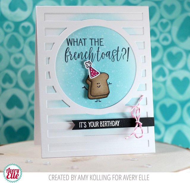
Amy created this first card for us today. I love how cute the image looks inside of our Horizontal Stripes die cut and that sentiment is the best!!
Supplies:
Supplies:
Thanks Amy and Maska for sharing with us today. Thank YOU for stopping by to take a peek. Have a great day!


2 comments:
This is such a fun card. Love it.
great projects and I'm lovin' everything about that ice cream page, which SO applies to our crew! thanx for the inspiration!
Post a Comment